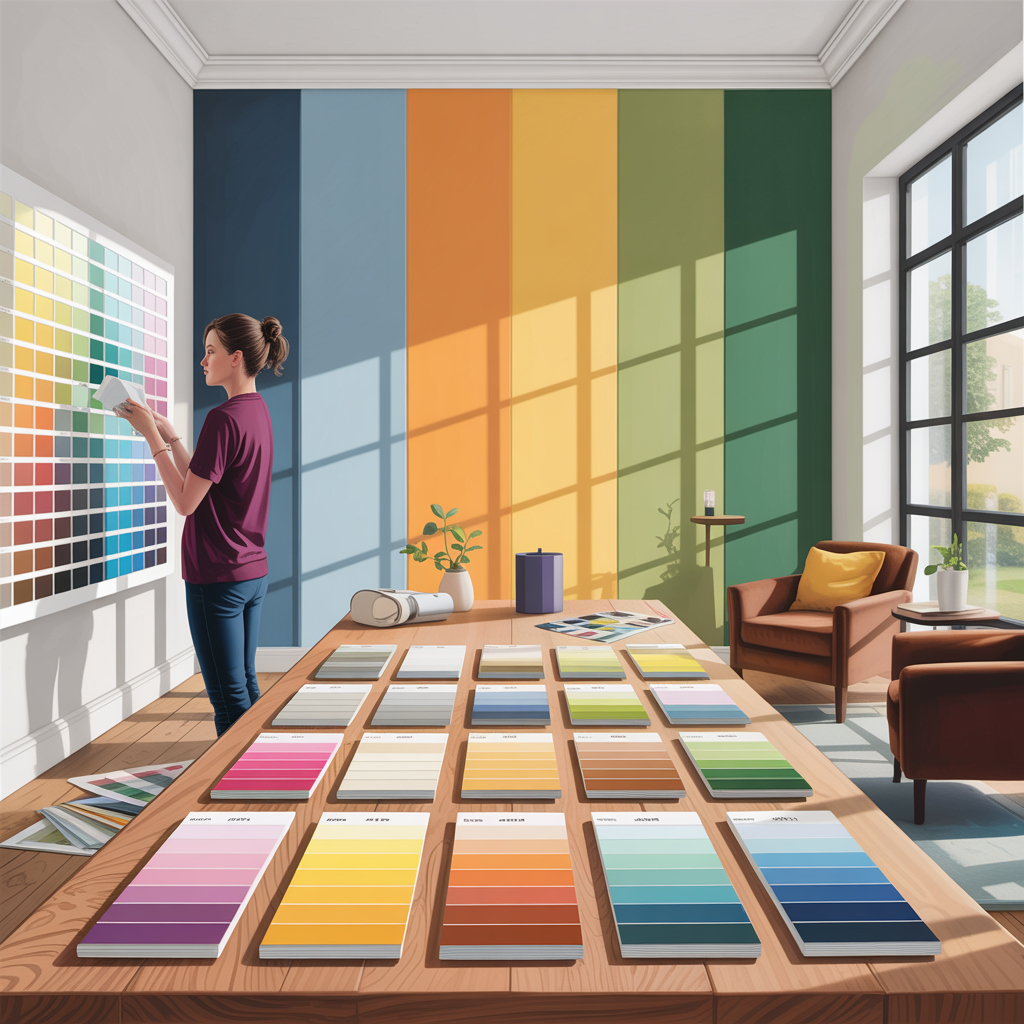
Choosing the right color scheme for your room can significantly impact its ambiance and functionality. The colors you select can influence your mood, energy levels, and overall comfort.

When it comes to designing your room, the best colors can vary based on personal preferences, room purpose, and lighting. For instance, calming colors like blues and greens are ideal for bedrooms, while vibrant colors like oranges and yellows can energize living areas.
Understanding how to choose the right colors is crucial for creating a harmonious and inviting space.
Key Takeaways
- Consider the room’s purpose when selecting colors.
- Think about the lighting and how it affects the color.
- Personal preferences play a significant role in color choice.
- Different colors can influence mood and energy levels.
- Test colors with samples before making a final decision.
Understanding Color Psychology in Home Design
Color psychology plays a crucial role in home design, influencing how we feel and interact within our living spaces. The colors we surround ourselves with can evoke emotions, stimulate the senses, and even affect our mood and energy levels.
How Colors Affect Mood and Emotion
How Colors Affect Mood and Emotion
Different colors can elicit different emotional responses. For instance, warm colors like red, orange, and yellow are often associated with feelings of warmth, comfort, and excitement. On the other hand, cool colors such as blue, green, and purple tend to have a calming effect, promoting relaxation and serenity. “Colors can dramatically influence our mood, energy, and even our perception of time and space,” as noted by interior design experts.
Cultural and Personal Associations with Colors
Cultural and personal experiences also play a significant role in how colors are perceived. For example, while white is often associated with purity and innocence in Western cultures, it’s associated with mourning in many Asian cultures. Understanding these nuances is crucial when selecting colors for your home, as it allows you to choose hues that not only appeal to you personally but also respect the cultural context.
By considering both the psychological impact of colors and their cultural significance, you can create a home environment that is both beautiful and meaningful.
Assessing Your Space Before Choosing Colors
Evaluating your space is vital to making informed decisions about room color ideas. Before selecting colors, it’s crucial to understand the room’s conditions, including natural light and architectural features.
Measuring Natural Light in Your Room
Natural light significantly affects how colors appear in your room. Observe the room at different times of the day to understand the light patterns. Consider the orientation of your windows and the amount of sunlight they receive.
- Note the time of day when the room receives the most natural light.
- Observe how the light changes throughout the day.
- Consider using mirrors or reflective surfaces to enhance natural light.
Considering Room Size and Architecture
The size and architecture of your room also play a significant role in choosing paint colors for rooms. Larger rooms can handle bolder colors, while smaller rooms may benefit from lighter shades to create a sense of space.
Consider the room’s architectural style and features, such as columns, arches, or vaulted ceilings, when selecting colors. These elements can influence the overall aesthetic and guide your color choices.
For instance, a room with high ceilings can accommodate darker, richer colors on the upper walls, creating a cozy atmosphere.
By carefully assessing your room’s natural light, size, and architecture, you can make informed decisions about room color ideas that enhance the space’s functionality and beauty.
Best Color for Room Design: A Comprehensive Guide
With the myriad of colors available, determining the best color for room design requires a thoughtful approach that balances personal taste with design principles. The right color scheme can elevate your home’s aesthetic, making it feel more spacious, cozy, or vibrant, depending on your preferences.
When exploring home interior color schemes, it’s essential to consider both trending colors that bring a modern touch and timeless choices that have remained popular over the years. This balance ensures your home looks stylish and contemporary without sacrificing enduring appeal.
Trending Colors for Modern Interiors
Currently, modern interiors are embracing a range of bold and soothing colors. Shades of blue, from soft sky tones to deep navy, are particularly popular for their versatility and calming effect. Earthy tones, such as terracotta and sage green, are also trending, bringing warmth and a natural feel to spaces.

Timeless Color Choices That Never Fail
While trends come and go, certain colors remain timeless. Neutral shades like white, beige, and gray are staples for their ability to complement any decor and provide a clean, elegant backdrop for furniture and artwork. These colors also offer the flexibility to add pops of color through accessories and textiles.
| Color Scheme | Description | Ideal Room |
|---|---|---|
| Monochromatic Neutrals | Variations of a single neutral color | Living Room, Bedroom |
| Earth Tones | Warm, natural colors like terracotta and sage | Kitchen, Dining Room |
| Bold Accents | Bright colors used as accents against a neutral background | Any Room |
By considering both trending and timeless colors, you can create a home interior color scheme that is both stylish and enduring. Whether you prefer the modern feel of bold colors or the classic appeal of neutrals, the key is to choose colors that reflect your personality and complement your home’s architecture.
Warm vs. Cool Room Colors: Making the Right Choice
Understanding the difference between warm and cool colors is crucial for creating the desired atmosphere in your home. The choice between warm and cool tones can significantly affect the ambiance and overall feel of a room.
Warm colors, including reds, oranges, and yellows, are known for creating a cozy and inviting atmosphere. They are ideal for spaces where you want to encourage social interaction and energy.
When to Use Warm Tones
Warm tones are perfect for living rooms, dining areas, and kitchens where you spend time with family and friends. Reds and oranges can stimulate conversation and appetite, making them ideal for dining rooms and kitchens. Yellows can add a bright and cheerful touch to these areas.

When to Use Cool Tones
Cool colors, such as blues, greens, and purples, have a calming effect and can make a room feel more spacious. They are suitable for bedrooms, bathrooms, and home offices where relaxation and focus are key.
Blues and greens can create a serene atmosphere, perfect for bedrooms and bathrooms. Purples can add a luxurious and creative touch to home offices or reading nooks.
Ultimately, the choice between warm and cool room colors depends on the purpose of the room and your personal preferences. By considering the psychological effects of different colors, you can make informed decisions to create the perfect ambiance for each space in your home.
Creating a Room Color Palette from Scratch
Creating a harmonious room color palette can seem daunting, but with a few simple guidelines, it’s entirely achievable. The key is to strike a balance between different colors that complement each other and reflect your personal style.
To start, it’s essential to understand the principles behind a successful color palette. One effective method is the 60-30-10 rule, which involves dividing your color scheme into 60% of a dominant color, 30% of a secondary color, and 10% of an accent color. This distribution creates a balanced and visually appealing atmosphere.
The 60-30-10 Rule for Color Distribution
Applying the 60-30-10 rule can be broken down into simple steps:
- Choose a dominant color (60%) that will cover the majority of the room, such as the walls.
- Select a secondary color (30%) that complements the dominant color, which can be used for furniture and larger decorative items.
- Pick an accent color (10%) to add a pop of color through smaller decorative items like throw pillows, vases, or artwork.
This rule helps in creating a cohesive look that is not overwhelming. For instance, if you’re designing a living room with a calming atmosphere, you might choose a soft blue as your dominant color, a crisp white as your secondary color, and a vibrant coral as your accent color.
Starting with Inspiration Pieces
Another approach to creating a color palette is to start with inspiration pieces that you love, such as a piece of artwork, a rug, or a favorite piece of furniture. These items can serve as the foundation for your color scheme, ensuring that the final result is something you enjoy.
For example, if you have a beautiful piece of artwork that features a combination of colors, you can pull those colors into your room design. This method not only simplifies the decision-making process but also ensures that your color palette is meaningful and connected to your personal taste.

By combining the 60-30-10 rule with inspiration pieces, you can create a room color palette that is both harmonious and reflective of your style. Remember, the goal is to create a space that feels welcoming and comfortable, so don’t be afraid to experiment until you find the perfect combination.
Room-Specific Color Ideas
Different rooms in your home serve different purposes, and the right color can enhance their functionality. Whether you’re looking to create a cozy atmosphere in your bedroom or a vibrant space in your living room, the color palette plays a crucial role.
Living Room Color Strategies
The living room is often the heart of the home, where family and friends gather. For a welcoming atmosphere, consider warm neutrals like beige or soft grays. If you prefer a bolder statement, rich colors like emerald green or navy blue can add sophistication. Using a combination of colors can also create visual interest.
- Neutrals like beige or soft gray for a calm ambiance
- Rich colors like emerald green or navy blue for a bold statement
- Earth tones for a cozy, inviting feel
Bedroom Paint Color Solutions
Bedrooms are personal sanctuaries, and the right color can promote relaxation. Soft blues, pale lavenders, or muted greens are known to create a calming environment. For a more dramatic look, consider deep, rich colors that can add a sense of luxury.
Consider the natural light in your bedroom when choosing a color, as it can significantly affect how the color appears throughout the day.
Kitchen and Bathroom Color Approaches
Kitchens and bathrooms require colors that are both functional and aesthetically pleasing. In kitchens, whites, creams, and warm woods can create a welcoming and clean look. For bathrooms, soft whites, blues, or greens can evoke a spa-like ambiance. Durability is key in these areas, so consider colors that will withstand moisture and frequent cleaning.

When choosing colors for your kitchen or bathroom, remember that lighter colors can make small spaces appear larger, while bold colors can add character to larger areas.
How Lighting Transforms Your Color Choices
The interplay between lighting and color is complex, and understanding this relationship is key to making informed design decisions. Lighting can drastically change how colors appear in a room, affecting the ambiance and overall aesthetic.
Effects of Different Light Sources
Natural and artificial light have distinct effects on color perception. Natural light, which varies throughout the day, can make colors appear more vibrant and true to their hue. In contrast, artificial lighting, such as LED bulbs or lamps, can cast different tones depending on their color temperature.

Testing Colors Under Various Conditions
Before committing to a specific color, it’s essential to test it under different lighting conditions. This can be done by painting a small section of the wall or using color samples. Observing how the color looks at different times of day and under various artificial lighting setups will help ensure the chosen color achieves the desired effect.
| Lighting Type | Effect on Colors | Best For |
|---|---|---|
| Natural Light | Makes colors appear vibrant and true | Daytime ambiance |
| Warm Artificial Light | Casts a warm tone, can make colors appear richer | Cozy, relaxing spaces |
| Cool Artificial Light | Can make colors appear sharper and more energizing | Workspaces, modern interiors |
By understanding how different lighting conditions affect color and taking the time to test colors thoroughly, homeowners can make more informed decisions that enhance their living spaces.
Matching Colors with Existing Furniture and Décor
A well-designed room starts with matching the right colors to your existing furniture and décor, setting the tone for the entire space. This crucial step ensures a cohesive look that ties together all elements of your room.
Working with Fixed Elements in Your Space
When choosing a color scheme, it’s essential to consider the fixed elements in your room, such as furniture, flooring, and large appliances. Start by identifying the dominant colors in these elements. For instance, if you have a bold-colored sofa, you can choose wall colors that complement it. As interior design experts often say, “A good rule of thumb is to select a wall color that is one shade lighter or darker than the dominant color in your furniture.”
Creating Contrast vs. Harmony
Deciding between creating contrast or harmony with your color choices depends on the desired effect. Contrast can make a room more dynamic by highlighting different elements, while harmony creates a soothing and cohesive atmosphere. For example, if your furniture is a bold color, you might choose a more subdued wall color to create harmony. Conversely, if your furniture is neutral, a bold wall color can create a striking contrast.
As
“The right balance between contrast and harmony can elevate the aesthetic of your room.”
This balance is key to a well-designed space.
Common Color Mistakes and How to Avoid Them
Even with careful planning, color mistakes can occur, but knowing how to avoid them can save time and money. When designing your room, it’s easy to get caught up in the excitement of choosing a color, but there are common pitfalls to watch out for.
Overlooking Undertones
One of the most common mistakes is overlooking the undertones of a color. Undertones can greatly affect how a color looks in your room, especially under different lighting conditions. For instance, a paint color with a red undertone might look perfect in the store but clash with your furniture at home. To avoid this, always check the undertones of your chosen color and consider how they will interact with other elements in your room.
Ignoring the Flow Between Rooms
Another mistake is ignoring the flow between rooms. When the colors in adjacent rooms clash, it can create a disjointed feel throughout your home. To maintain harmony, choose colors that complement each other. Using a neutral color palette for walls can help create a cohesive look, making it easier to transition between rooms. For interior paint color tips, consider the overall flow and how different colors will work together.
By being mindful of these common mistakes and taking steps to avoid them, you can create a beautiful, harmonious space that reflects your personal style. Remember, the key to successful interior design is not just about picking the right colors, but also about creating a flow that makes your home feel welcoming and cohesive.
Conclusion
Choosing the right colors for your room can be a daunting task, but with the insights gained from this article, you’re now well-equipped to make informed decisions. By understanding color psychology, assessing your space, and considering factors like lighting and existing furniture, you can create a harmonious and functional room that reflects your personal style.
To effectively choose room colors, remember to balance warm and cool tones, and don’t be afraid to experiment with different shades. Use the 60-30-10 rule as a guideline to create a visually appealing color palette. For inspiration, explore trending colors and timeless choices that suit your room’s purpose, whether it’s a living room, bedroom, or kitchen.
By avoiding common color mistakes, such as overlooking undertones and ignoring the flow between rooms, you can ensure a cohesive look throughout your home. With these room color ideas, you’re ready to transform your space into a beautiful and inviting haven that you’ll love spending time in.
FAQ
What is the best color for a small room?
For small rooms, it’s often recommended to use lighter, neutral colors like Sherwin-Williams’ ProClassic White or Valspar’s Warm White to create the illusion of more space and make the room feel more airy.
How do I choose a color scheme for my living room?
To choose a color scheme for your living room, consider the room’s purpose, the furniture and decor you plan to keep, and the natural light. You can also draw inspiration from a favorite piece of art or furniture. Using the 60-30-10 rule can help balance your color choices.
What’s the difference between warm and cool colors?
Warm colors, such as oranges, reds, and yellows, tend to evoke warmth and can make a room feel cozier. Cool colors, including blues, greens, and purples, can create a calming atmosphere and make a room feel larger. The choice between warm and cool colors depends on the desired ambiance and the room’s function.
How does lighting affect the color of my walls?
Lighting can significantly impact how wall colors appear. Natural light can bring out the true tone of the color, while artificial lighting can alter it. It’s essential to test paint samples under different lighting conditions to ensure the chosen color looks good at all times of day.
Can I use dark colors in a small, poorly lit room?
While dark colors can make a room feel smaller and more enclosed, they can also be used effectively in small, poorly lit rooms if balanced with lighter accents and proper lighting. However, it’s generally recommended to opt for lighter shades to brighten up the space.
How do I match paint colors with my furniture?
To match paint colors with your furniture, start by identifying the dominant color in the furniture or decor. You can then choose a wall color that complements or matches this color. Consider the overall aesthetic you want to achieve, whether it’s harmony or contrast, and select a paint color accordingly.
What are some timeless color choices for bedrooms?
Timeless color choices for bedrooms include soft neutrals like Beige or Light Gray, which can create a calming atmosphere. Soft blues and pale greens are also popular for their soothing effects. These colors are versatile and can be paired with a variety of decorating styles.
How do I avoid common color mistakes when painting my home?
To avoid common color mistakes, consider factors like the room’s lighting, the color of fixed elements like flooring and furniture, and the flow between rooms. Testing paint samples on the walls before committing to a specific color can also help prevent unwanted surprises.


[…] The color story for 2025 moves away from the safe neutrals that dominated previous years. Earthy, grounding tones take center stage, with deep terracotta, chocolate brown, and muted sage leading the palette. These colors create spaces that feel warm, nurturing, and connected to the natural world. […]
Comments are closed.